
Graphic design work and the intrigue of digital artistry is one of the first areas that propelled me into the world of programming and UX. I’ve worked on plenty of odds and ends for my own enjoyment and growth, as well as for events and groups.
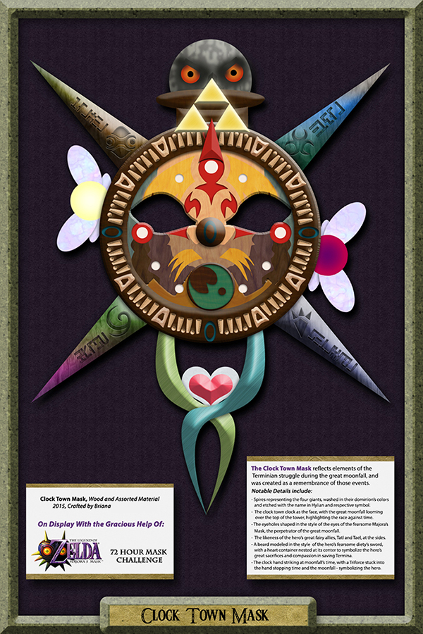
One fun design where I pushed myself to leverage new techniques and approaches was my “Clock Town Mask” display for the 72 Hour Mask Challenge put on by Nintendo.
I had sketched a mask design on a piece of paper, and knew I did not have the time or resources to create it in real life. Instead, I tried to replicate the textures of a primarily wood mask in Photoshop, and to set the design in what looked like a museum display case.
While looking back the design is a bit flat, I’m still quite proud of some of the unique ways I was able to bring my sketch to life in this design.
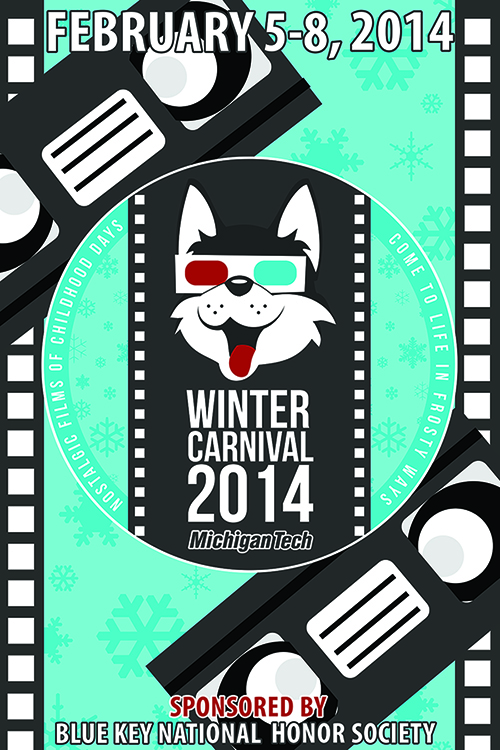

As a member of the Blue Key Honor Society, one of my duties in undergraduate was to assist with our university’s Winter Carnival. I worked on the publicity committee, allowing me to utilize my graphic design interest.
While the logo is created by community members as part of a yearly contest, I wanted to ensure that I incorporated the feeling and color scheme of the logo in the work I was asked to do.
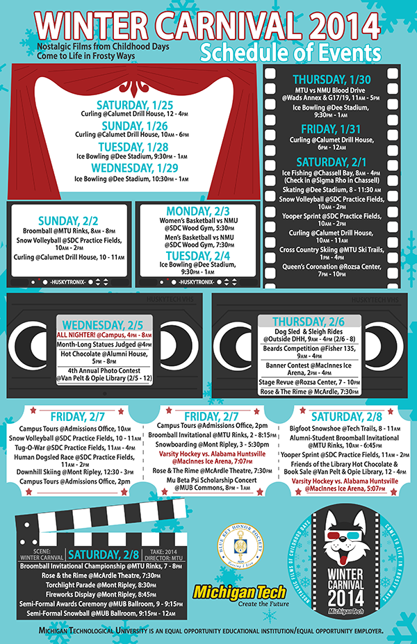
Two major pieces I created for the 2014 Winter Carnival were the ice arena banner and the event schedule poster. The banner is largely focused on the winner’s logo, but I wanted to ensure to draw focus to it in an interesting way. Given the theme, I opted for “papercut” style VHS tapes drawing the eye to the logo, with film reel running up and down the sides. I used the same snowflake pattern of the winning logo in the backdrop to aid in consistency.
I am especially proud of my work on the calendar of events. I used the same “papercut” style and the five colors used in the logo, and managed to create a visually interesting schedule of events that incorporated various film-associated shapes. The poster was a limited size and needed to incorporate all of these details – I was quite happy with the ways I fit everything in!

I also created many posters and logos for various groups. One of my most utilized designs was for our undergraduate student government. A friend in the group asked me for logo ideas. I utilized the stripes from the end of our “Piano Dog” logo to cut the ‘U’ in a visually interesting way, and then used the husky head to create the curve of the S. It was a simple rough draft, but worked! While I was never told whether the group liked my design, the next year I noticed USG branding themselves with a clean and finalized logo featuring…a cut U and a husky head in the S. I guess they must have liked it!
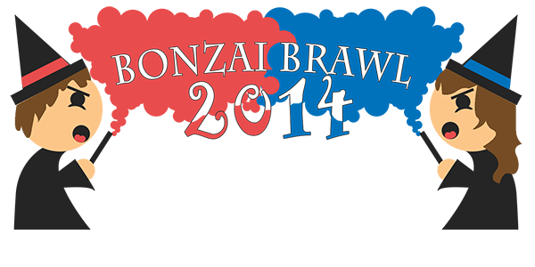
I also created the logo design for our 2014 BonzAI Brawl, an event where students create and battle AI. The theme was wizards for the year, and I used a 5-color palette to limit t-shirt printing costs. This logo was featured on t-shirts and posters. It was simple, but fun and effective!
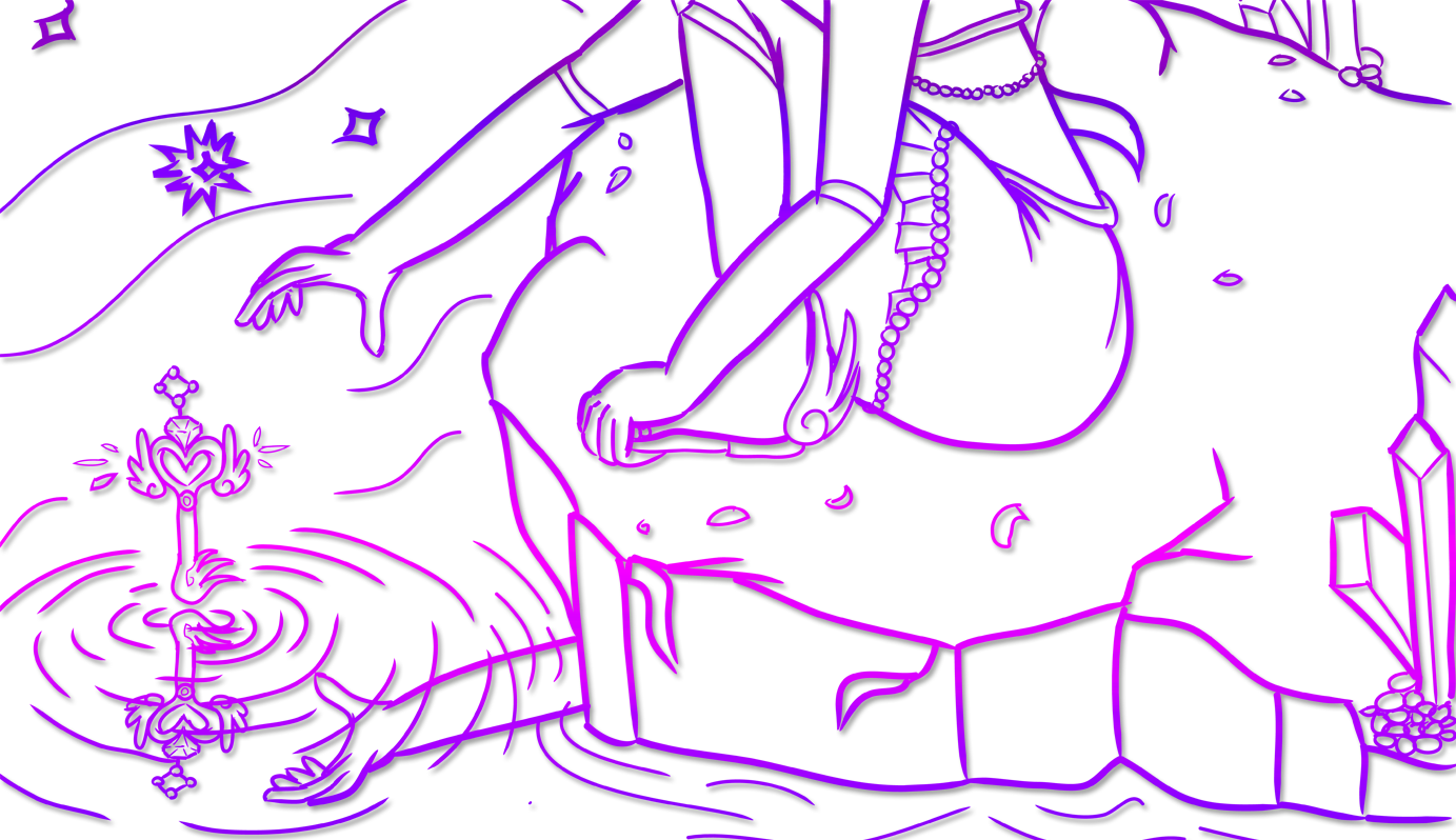
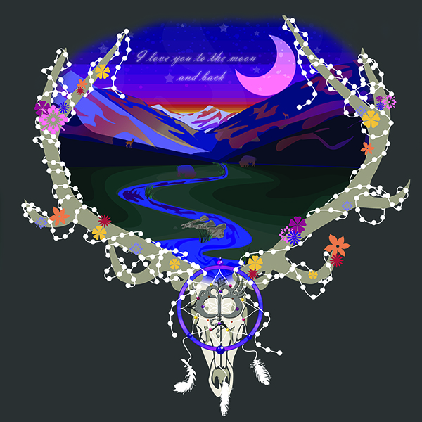
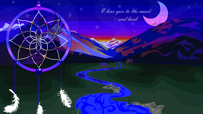
One of my larger practice designs as a personal project was my “Colorado Sunrise” designs. Inspired by my family trips to Colorado, I wanted to create a dreamy image that evoked the “happy place” I saw in my mind. I wanted to practice with the pen tool, and worked to draw and shade the scene using only basic shapes and shape cutouts I had carved with the pen.
I then wanted to set the design as though it was being seen from a “portal”, and placed the central portion of the design inside a beautiful skull cutout, which I adorned with beads and floral accents. I didn’t realize until I was working on it and needed to put a background color behind it, but this would make a beautiful print for a shirt!

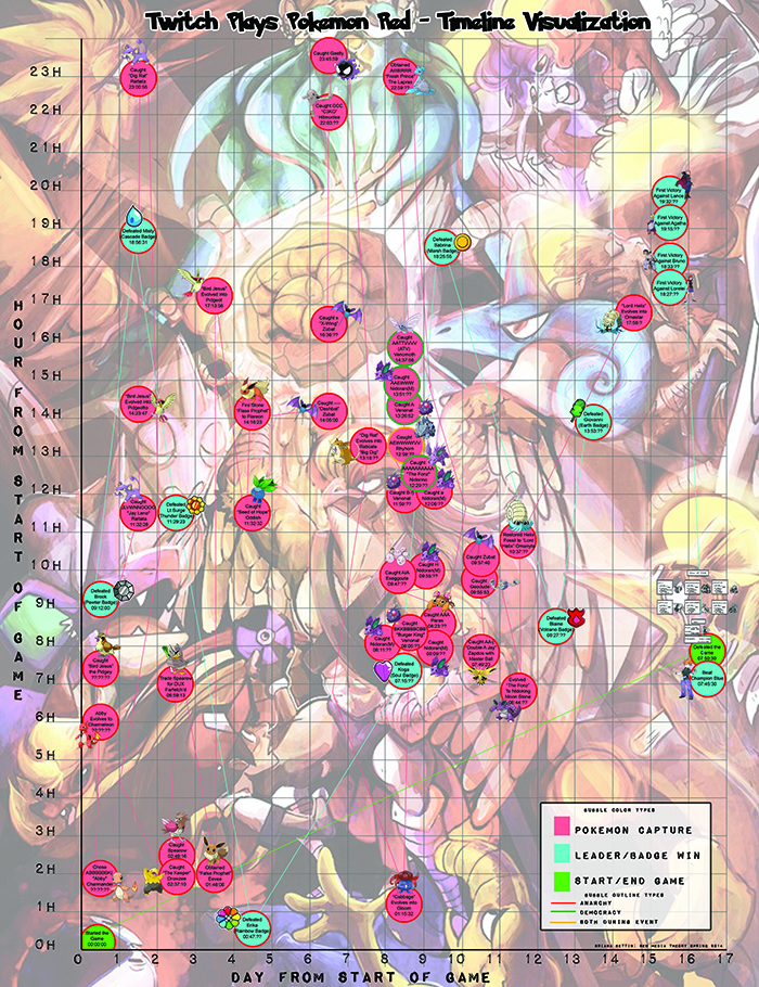
I have also been extremely interested in data visualization, and especially in exploring interactive methods for it.
For a media course at my university, I chose to explore visualizing the data of Twitch Plays Pokemon, and wanted to do so by laying out events in various ways.
Ultimately, my goal was to have an interactive website with a traversable and filterable timeline. During a hackathon I had a functional “timeline” to click through, but it was not the engaging feature I wanted for my final project.
Instead, I chose to create a static visualization connecting types of events across days and time. This allows users to see active time periods, days, and types of events, as well as the “mode” of game during the events.
The background image was added to fill deadspace, but was created by another fan of the series (IrisChroma on DeviantArt). Given more time for this project (and not a change in trajectory of my approach!) I would have devleoped my own backdrop or put a bit more design such that I did not feel the visualization needed one.
I certainly think there are a lot of aspects of this I could have done better on. But, for my first major data visualization telling several data stories at once, I was quite happy with what I learned from the process. And certainly, I’d like to try my hand at visualization again – maybe without it being a class deadline though!