

The design of this website – and my branding in general – is one of my most consistent projects to keep coming back to. I often find myself using my website and its branding to reflect my design inspiration and development.
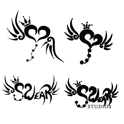
My logo icon concept has always been a crowned heart with wings and a bead trail – I sketched them constantly growing up, and always identified with the icon as a symbol of hope and expressiveness. I was drawn to the idea of representing this concept in a more tattoo style for two reasons: it felt more grounded and balanced its cuteness with some edge; and also that it made it easier to imagine one-color designs that weren’t simply a logo outline.
The “Swear” Studios name came about through several layers of thought, but stuck because of the way the letters were able to be transformed to situate the logo icon within them. The first time I realized the ‘W’ could curl toward the ‘S’ and both could form the heart, there was no other possible name. I still have the original notebook sketch clipping from the first time I created the text logo. That clipping was used to create the outline for the original logo design.
The logo has gone through a bit of modification, but overall, it has kept its theme. I felt that the original iteration of the logo was a bit too “thick” and stamplike – this was a holdover of me trying to copy lines from my sketching, but missing their tonal range in as I created a one-color version. There is some charm in the thick letters, but they’re significantly harder to read as they smudge together – not what I wanted. The slight perspective in the heart also looked better in a sketched version, but comes across as uneven and lopsided in a one-color version, and the beads don’t feel dynamic relative to the apparent motion from the perspective.
The current iteration flattens and centers the heart as well as adding crisper edges to remove the thick stampy feeling. The lettering also receives this treatment, making it easier to distinguish each character. I think it’s particularly noticeable on the ‘W’ how the more even heart makes the lettering feel more consistent overall.
Currently, Swear Studios is run through WordPress CMS, but things weren’t always that way. For many years I managed each page of my website individually, even blogging through use of a template HTML file and structured uploads and updates straight through an FTP. The process was not optimized in the slightest – I found using includes to incorporate a single navigation bar and footer bar across all pages to be a luxury!
My “wild west” days of Swear Studio were certainly fun – I felt like I was playing in the dirt and building something ground up, but those days were also difficult for layered reasons. I was a web designer after all, I knew there were more efficient ways I should be doing things. I felt as though using a different system was “admitting defeat”, but I didn’t have time to invest in revamping and optimizing the way I was doing things, as my updates were often already sporadic around other work. Uploading content or making design changes often stagnated, as everything felt so caged in by my prior choices.
I ultimately made the decision to convert Swear Studios to a CMS, but I wasn’t sure I would use WordPress at first. Hipster as it seems it felt too “mainstream”, and I felt as though being a professional, I should opt for something different. My prior web work also hadn’t used WordPress, which brought in a splash of fear at learning curve. I weighed pros and cons and looked over many options – and ultimately, WordPress won out. The features were there, support was there for me to learn on my own, and if I needed to help others with their websites, knowing a more common tool seemed like the right move to make.

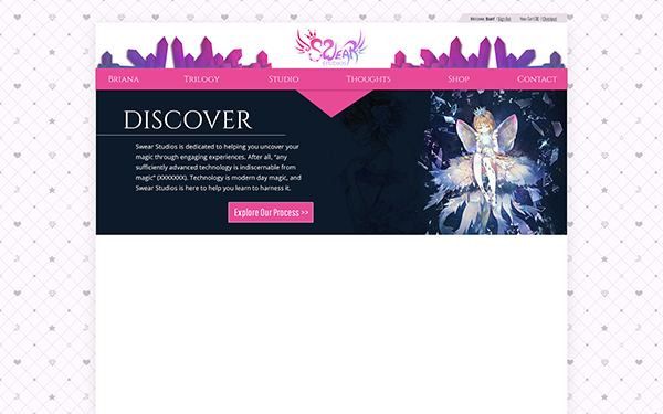
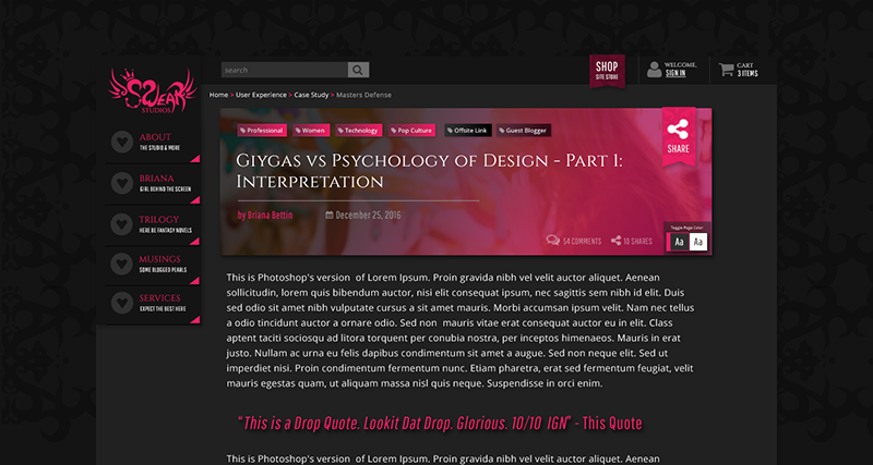
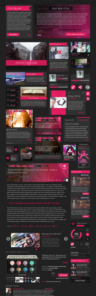
What most surprised me in jumping back into the fray with WordPress was how quickly and closely I was able to realize my site design vision. I had developed the first design as a mockup in Photoshop for a “light” look, and was convinced I would struggle to implement that vision. In my web design work I felt like I could never get my CSS to do justice to my Photoshop visions – technically the components were present, but it always felt like something was lacking in their heart and realization when they were implemented.
The screenshot here was taken to prove to myself side by side that no, I wasn’t dreaming – I the design didn’t feel weakened in implementation! Obviously a few font fixes needed to be done, and the art changed up to my Swear Web Art, but the design still felt like it had “spirit” to it. Having gone back for my PhD at this point and thus, not doing much professional web design work, I was astounded and pleased with myself. My skills weren’t overly rusty, and my design felt cohesive and still lively! I’m sure the inspiration the light theme mockup gave me and the passion to realize it didn’t hurt either.
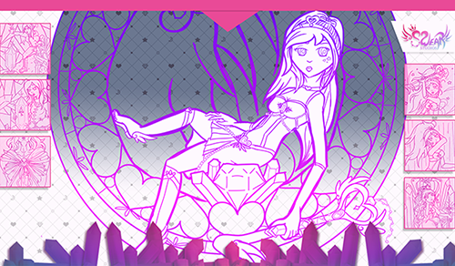
The light swear studios theme is a motif surrounding the “magical girl” concept. I have always had magic and fantasy themes in mind for the vibe of Swear Studios – one reason the heading font used across the site and for the word “Studios” is reminiscent of old fable book lettering. To fit with this motif, it also features a warm grey “tufted” background, incorporating magical symbols while evoking a playful yet plush, luxurious tufting style that one may find on the fabrics in a fantasy castle. The crystals add to the magical theme while also creating visual interest.
I was so excited by this theme design that I created a slide deck theme using the motif and assets. This theme has been used in spaces where I wanted to add personal flair to my slide deck. I also created a large mousepad for my home office featuring the studio web artwork and design assets.
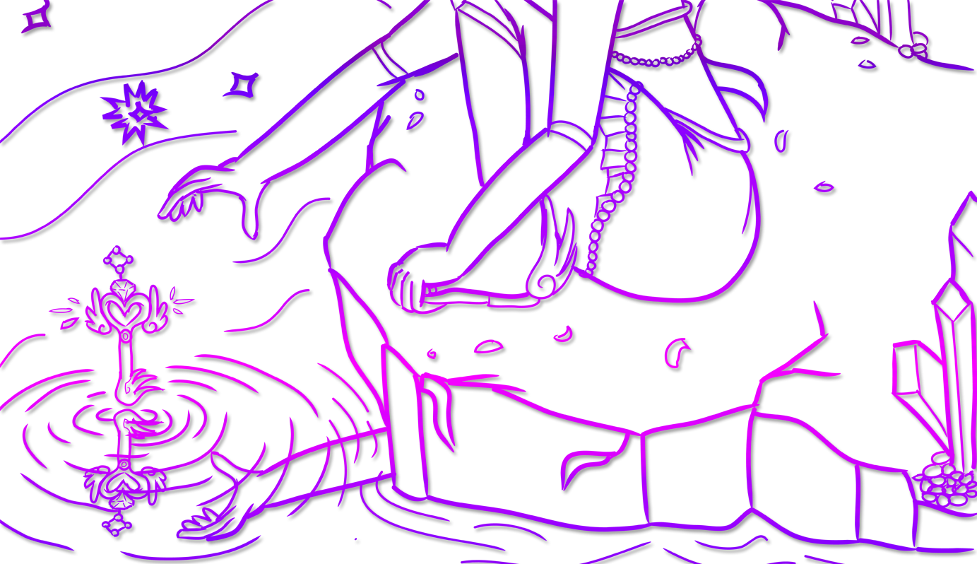
Before I found excitement for the light “magical girl” concept, the studio’s theme had always been envisioned as more “dark/gothic fantasy”. Elements were intended to feel edgier, with some mystery to them. When I worked in web design, one of my practice spaces for thinking about modular component design was considering how Swear Studios elements might be represented with a dark fantasy-meets-modern theme. While I never built these components out as I settled on the light direction before that point, I was always very proud of this styled element “sticker sheet”, where I explored how widgets and elements could be approached.
Taking on this approach to thinking through site design really opened my eyes to possibilities in my design. I don’t think I would have landed on the light design I was happy with if I hadn’t done this exploration. I still love components in this sticker sheet, but the branding moved to match my current theme and style more appropriately.
The sticker sheet is also an example of how I often approached projects in my web design professional work. I would consider the design elements that were likely to commonly appear on the site, and place them together on a “sticker sheet” to check cohesion, how color swaps or font swaps affected elements, and so on. I would then use sticker elements alongside concepts for the overall site theme to generate examples of page layouts, like the below concept for a blog post.
While this particular iteration of “dark fantasy” design theme ultimately was never seen on site, it was an integral part of the site’s branding journey. Themes that led to this iteration did appear on physical contact cards I used at the time. These cards show my initial beginnings of experimenting with both “light and dark” concepts for branding design.
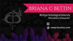
These business cards also feature my personal monogram logo, which mirrors the site motif. My initials “BCB” are seen cut into the logo, which is created using two B’s mirrored to form a butterfly-wing styled heart. The line for both B’s extends between to form a staff, which the “C” appears on as a small moon. The beaded chain flows from the staff, and the wings and crown extend from the heart as they do in the Swear logo.
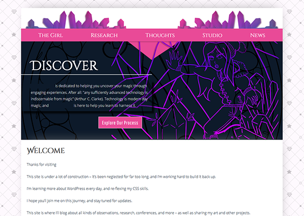
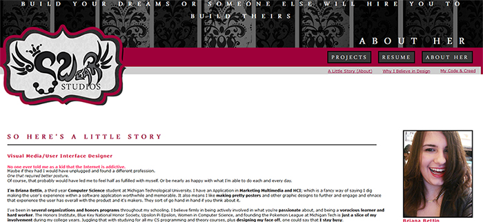
In talking about the site’s journey, I think it’s also valuable to reflect on how far it has come, even when I think of how far there is yet to go, and how much more my skills can still improve. I managed to find a screenshot of the site when I first gained the domain and uploaded a first iteration in undergraduate. I had never designed a “full” website before – the closest I had done was single page concepts like Neopets user lookups, or iframe’d content sitting in a single “layout image”.
The first ever iteration of the Swear Studios site shows the beginnings of its general theme motif, but also shows how much has changed. I was scared to use a bright pink accent when I first designed the site, even though I loved pink. The logo had not yet transformed to a one color variant, it was just a digital version of my sketch, with the logo components called out using awkward color shift through the letters.
I felt powerless in my design skills – CSS was something I was only beginning to grasp and feel I could wield to place elements as I wanted, and fluid layouts (pre-grid system thinking!) were entirely a new way of thinking. It’s easy to see how I relied on simple color blocks and as little layout variation as possible. It’s basically….just a flat page. I didn’t yet know how to use CSS to articulate my vision and to use assets effectively, so the traces of “dark fantasy” only come through in the storybook font, the pinstriped baroque header backdrop, and the filigree plate behind the logo. It feels like an arts and crafts project more than dark fantasy.
Swear Studios has long been my “creative baby”, and of course, this has made it difficult to innovate and reflect on it at times. There’s fear of not realizing the vision in your head, and not acting on designing because of it. Sometimes you feel stuck, and because it’s so personal, it’s hard to see past the walls and just do something.
I know there is still plenty of work to do, and plenty I have to learn in terms of branding and design. I feel a bit shy even sharing aspects of this project, because it always feels like there is more to do, and looking back at “the past” it feels painful to realize how unbaked my skills were. But as I look at this site’s journey and my use of tools and design skills I’ve learned, I’m also proud of the progress I’ve made. Even if being my “creative baby” has made the journey difficult, that passion has helped me persist. I’m excited to see where my design and skills journey continues to take me.
