Enchanted Forest Wedding

When my partner and I were planning our wedding, I knew that I wanted to be able to design many of the elements for our day.

We had chosen teal and pink as our colors, with grey as the base neutral. Thematically, the designs were planned around the idea of an elegant enchanted forest. After all, our cake toppers were a Venusaur and Totoro – forest creatures that matched our theme and our interests.

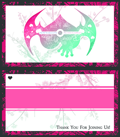
I designed a logo that incorporated aspects of our interests into a heart – Batman wings, a pokeball, and a small crown. This logo was used across several wedding design elements, creating a common branding “stamp” for our day.

Graphic of a wedding logo, which is in the shape of a heart that has a crown on it and bat wings extended from either side. The heart is a teal to pink gradient, with branches faded across it that look similar to marble streaks. In the center of the heart is a band and button similar to a pokeball from Pokemon, with the text "It Started Out with a Kiss How Did it End Up Like This?" in the band. Tiny hearts are cut out into the wings. Above the band it says "Briana and Nathan" and below the band it says "Sept. 6, 2014"

Design mockup of a wedding invitation bundle. The bundle features a square wedding invite, a vertical guest information sheet, and a horizontal RSVP card. The bundle is wrapped with a matching paper ribbon that is charcoal and pink with charcoal branches in the Pink area. A paper buckle seals the ribbon which features the letters B & N and "2014" over the pink to teal cherry blossom backdrop. The bundle is shown with a grey envelope.

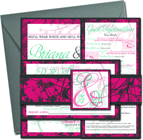
I also developed, printed, and assembled our invitation bundles, which included the invitation, information for guests, the RSVP card and its envelop, all wrapped in a styled paper ribbon with a front piece to serve as the “bow”.

I was enamored with the design having a square shape, which proved quite hard to find appropriate envelope sizes for. I was unable to locate grey envelopes in the appropriate shape and size like what are pictured in my original planning mockup. However, this turned out to be a blessing. I had the white square envelopes printed with the branch pattern used across all of the designs, and had the guest’s names and addresses printed to each envelope in the font used across the designs. Working with the available materials actually helped me create an even better design!


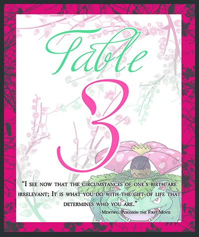
There are many design elements that go into a wedding – and I was committed to creating each of them. Each table was numbered with a custom designed card attached to a vintage book (we had met in a library!), and each card’s design element and quote had a story. Guests were encouraged to “guess” why their table had a particular design, and a designed key was provided at the front table if they wanted to see if they were correct. For example, the design shown here incorporated an image of Venusaur, who shares a color palette with the wedding and is my favorite Pokemon – and Venusaur’s Pokedex number is 3.

Additional designs included the program provided at the service, labels for a self-service candy bar; informational displays about the photo booth, candy bar, and guest book; a slideshow projected on the wall of the reception venue; and thematic blank thank you cards to fill out after the wedding.

Graphic design for a table number placecard for a wedding. The card has a charcoal and pink border that features charcoal branch patterns with in it. The center is whitespace with pink to teal branching cherry blossoms. An image of the Pokemon Venusaur is faded in the lower right. Script text says "Table 3" in teal and pink, and a quote from Pokemon the First Movie is below in serif font, saying "I see now that the circumstances of one's birth are irrelevant; it is what you do with the gift of life that determines who you are."

Graphic design of a wedding guest name placecard to be folded down the center. It features a charcoal and pink border with charcoal branches extending through the pink border. The white space on both sides has a teal to pink gradiated cherry blossom branch through it. The front features the back features the wedding logo. The front features a colored band for adding a guest's name to, with a small heart in the upper left. In the lower right, it says "Thank You For Joining Us!"

My wedding was also an opportunity to consider using custom design work to enhance the experience of the day.

I had wanted my guests to be able to sit wherever they liked at the wedding, but we had multiple entree options – which would prove difficult for servers to bring the correct plates. This hurdle was overcome with a color coding system. Each wedding dinner card was printed with the guests name, but the colored band the name was written in signified the entree. Venue staff were provided the color key for what entrees corresponded to each color: Chicken, Beef, or Special Dietary. This also provided a sheet to list the special dietary information required.

This design solution allowed for guests to sit wherever they liked with their name card in front of them, allowed the name card to be a conversation aid in chatting among guests, and gave the venue staff an easy cue for entrees by table in the color key.


While I may look back and see aspects of these designs I would do differently now, I am quite proud of the designs I created for my wedding, and they helped to craft the experience of the day that I desired for my guests. This work even resulted in requests to assist others with their invitation designs as well!

Michigan Tech LoL Tourneys

One of my first major design tasks working in residential life at Michigan Tech was when a fellow student approached me to help with designs for a League of Legends tournament that was being planned on campus.

I knew nothing about League of Legends, but was excited to help with the project, and the tournament was officially recognized by Riot Games!

I planned the marketing campaign for the tournament in two phases. Phase 1 was the “Teaser” phase – the image to the right is from this. I developed six teaser flyers (three “light” and three “dark”) and four PowerPoint slides for the residence hall desk TVs that featured characters from the game, and unique phrases suggesting something upcoming, with only a date.

Powerpoint slide graphic depicting a female league of legends hero to the left with the text "Hold Nothing Back" large to the right. The date "3.17.2012" is prominent on the bottom.
Poster featuring art of League of Legends character Morgana, with the text "Prepare Yourself" to the left and date of March 17th, 2012 along the bottom

The flyers generated so much excitement on campus that students stopped by my dorm after realizing I had designed them to ask if I had certain characters. They were trying to “collect them all” and taking them from the walls because they were so excited for what was coming!


Poster with a collection of League of Legends characters along the top, and the text "Riot Games Official League of Legends Touranment" prominently situated next to the image. Details of the tournament are below on the poster, and at the bottom, the text "It's Here. 3.17.2012" is present.

In phase two, a consistent “team” image was used across all designs, with the slogan “It’s Here”. These items contained details of the event after the initial teaser hype, and used consistent branding to ensure recognizability across forms, such as table tents and bulletin postings.

After this two-phase campaign being the major marketing medium for the event, the initial tournament saw approximately 170 attendees. Our university had approximately 5,000 undergraduate students at that time – so this was a significant turn out for a first event of this kind, especially one that was competitive , required a registration fee, and had no existing club on campus! (The club later formed as a result of these tournaments).


After the success of the initial campaign, I was asked to return to assist in design for another two tournaments.

Our second spring tournament was a bit more subdued, but our fall tournament was one of the first weeks students were back on campus, and we wanted to make it a bit special.

I used the metal band “Pentakill” from the game as my inspiration this time with the tagline “Let’s Start a Riot” for a Warped Tour, punk-summer style aesthetic.

We held a graffiti contest to match the marketing as a side event, and staff and participant t-shirts were not only color-coded, but tie-dyed to match. I developed a large mural of the four poster designs that were created as a photo op for participants as well.

Picture of Briana in front of a large scale poster of mebmers of the League of Legends band Pentakill in the highly stylized style used for the tournament, with the "Let's Start a Riot!" logo in teh bottom right. Briana is wearing a tye-dyed t-shirt featuring the logo, which were designed for the tournament as well.

Working on Michigan Tech’s League of Legends tournaments was my first opportunity to plan a marketing campaign and see it realized. I learned a lot and gained a lot of confidence by wanting to see these events succeed.

Flyer design showcasing Morgana from League of Legends in the in-game band Pentakill, highly stylized to fit into a graffitti and paint-splatter style. The logo "Let's Start a Riot!" appears in the upper right corner, with a description of the location and event below. At the bottom, the text "Come As You Are" and the event date appear in distressed text.

My skills may have grown quite a bit since then, but I’m still quite proud of what I accomplished!

Faux Low-Poly Style

Around 2016, I became interested in the “low-poly style” that was very popular among indie video games and some areas of graphic design.

However, this low-poly style requires 3D rendering to achieve. While 3D rendering is certainly something of interest to me, I simply did not have the ability or time at the time to devote to learning that skill for a graphical style when I did not have a particular project to put it toward.

Instead, I practiced and found a lot of fun in achieving a “faux” low-poly style. This only required an image, which I then “drew” the polygons over.

The example to the right is the first image I did in this style, a “faux poly’d” and colored version of Majora’s Mask from The Legend of Zelda.

Image of the item Majora's Mask from the legend of Zelda, cut into a low poly style using geometric lineart over the top, and colored in.

Depiction of a young girl with her arm extended in a faux low poly style created by drawing the polygonal lines. The stock image used is faded underneath to showcase the reference used.

This image of a girl, and the image below of a bear, are two more stock images I practiced with after.

The image is faded underneath so the aspects “informing” the poly design can show through.

While I certainly still have an interest in learning more about true low-poly design, finding a work around that still looks intriguing and is fun to do was an exciting result as well!


Depiction of a bear's head in a faux low poly style created by drawing the polygonal lines. The stock image used is faded underneath to showcase the reference used.